Bridge In | Internship
Overview
In the second half of the iXperience program, we had the opportunity to work with a growing company. I was assigned to work under the company Bridge In with other peer members from the program.
Bridge In is a company located in Spain that aims to create a specialized service to help startups around the world scale their business by launching operations and hiring great talents in Portugal.
Objective
Bridge In has an Employer Record of Services web platform for Bridge In Connect, an internal platform that enables Bridge In to connect with their clients and their employees. They are finding the platform to be out of trend and not practical for their users. Thus, our objective in this program is to redesign their internal platform to help transform it into a user-friendly platform that can enhance the experience of keeping track records of the client and employees and other activities such as scheduling meetings, updating payrolls, adding subsidiaries, and more.
My Role
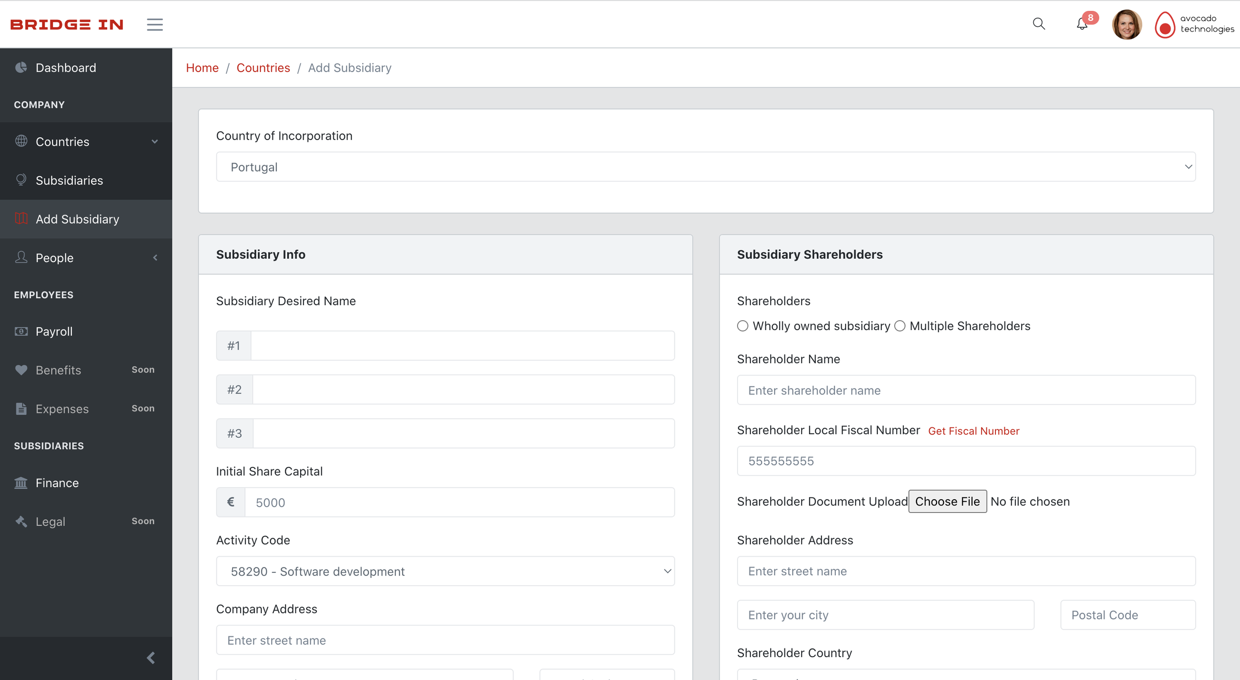
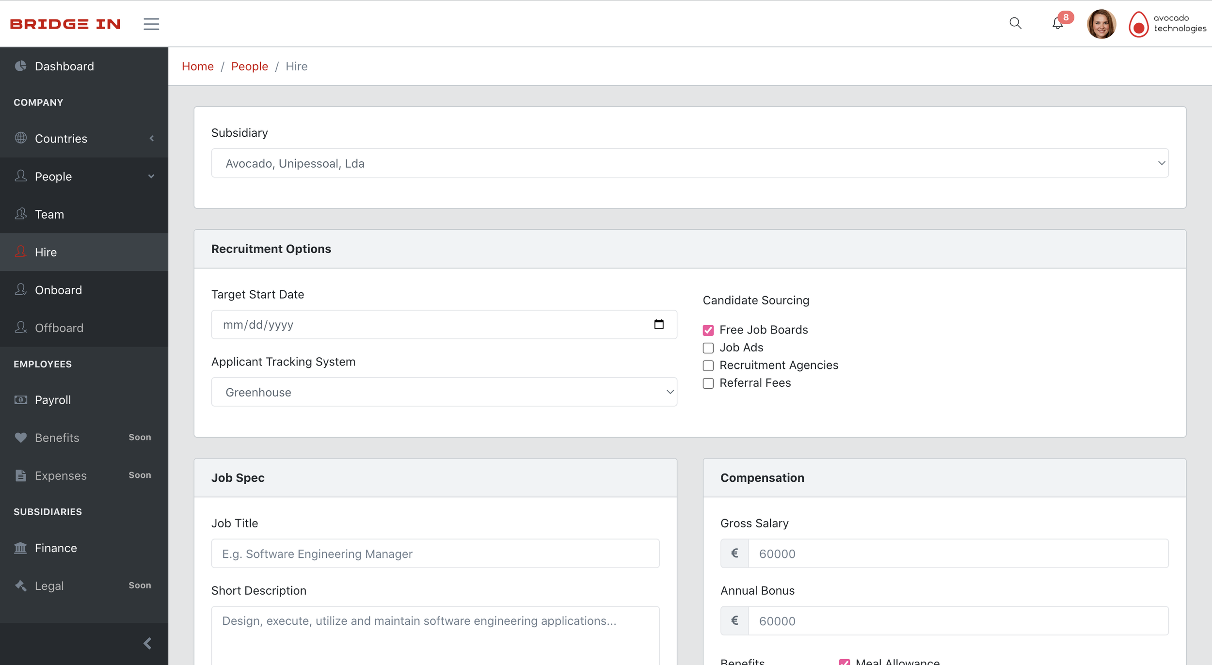
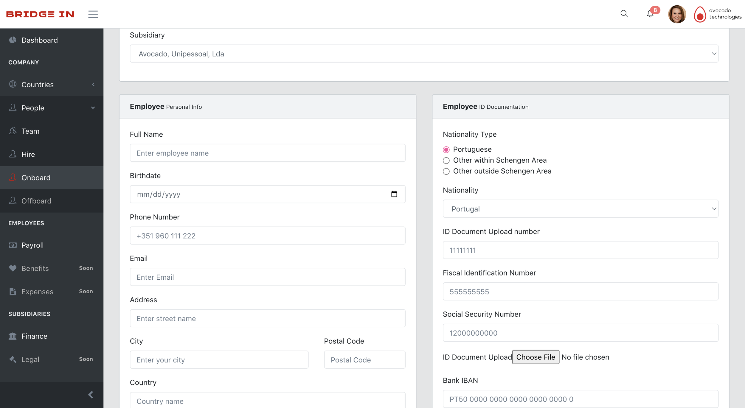
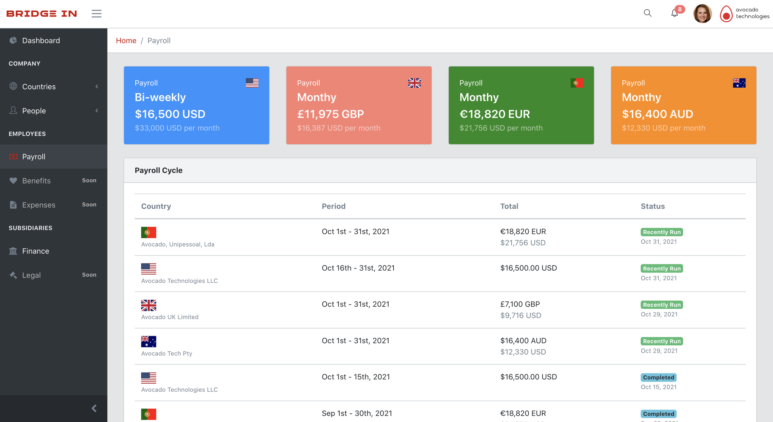
Our strategy was to divide the tasks evenly, and I was responsible for designing the dashboard, ‘Add Subsidiaries’ page, ‘Onboarding’ questionnaire, and the ‘Payroll’ page.
Design Process
Heuristic Evaluation
User Research
Prototype Sketching
Prototyping
BEFORE


HEURISTIC EVALUATION
Problems
After our initial evaluation of the current internal platform, we concluded to resolve the following usability issues:
#1 Colors are too bland
When it comes to colors, plain colors will decrease the motivation of users. Thus, we concluded to use more of the company’s main color.
#2 Visibility of status issue
The user will find this color coordination confusing as the previous pages are emphasized by the color red. Where it is more important to highlight the user’s real-time position.
#3 User control
When the users press the ‘reset’ button, there was no user control that allows them to reevaluate their decision before making it final.
#4 Unnecessary buttons
There were unnecessary buttons. Providing two different buttons with the same job is not necessary and will lead to confusion.
USER RESEARCH
User Persona
Our next objective was to create user personas to better understand what type of users would use the app. In this case, our target includes Bridge In’s super admin, Bridge In’s employees, and the Client’s super admin.
User Story
Organizing these user stories would assist us with our future steps in developing key features of the website. Here shows the steps each user goes through for different types of activities.
PROTOTYPING
Crazy 8s
We quickly put together some sketches of how the website would look and what features are needed to create a better user experience and solve the issues we have discovered.
High Fidelity Prototype
Our next assignment was redesigning some of the pages. Here I included all the pages I redesigned that is aligned to solving some of the issues on the previous design.
After completing the initial sketches, I started redesigning some of the pages. The following are some of the redesigned pages with improved features that allow us to solve some of the usability issues on the previous prototype.
Our strategy was to create a dashboard that includes important data that will help our users with their tasks. Allowing them to access their files easily and stay updated with the latest data.
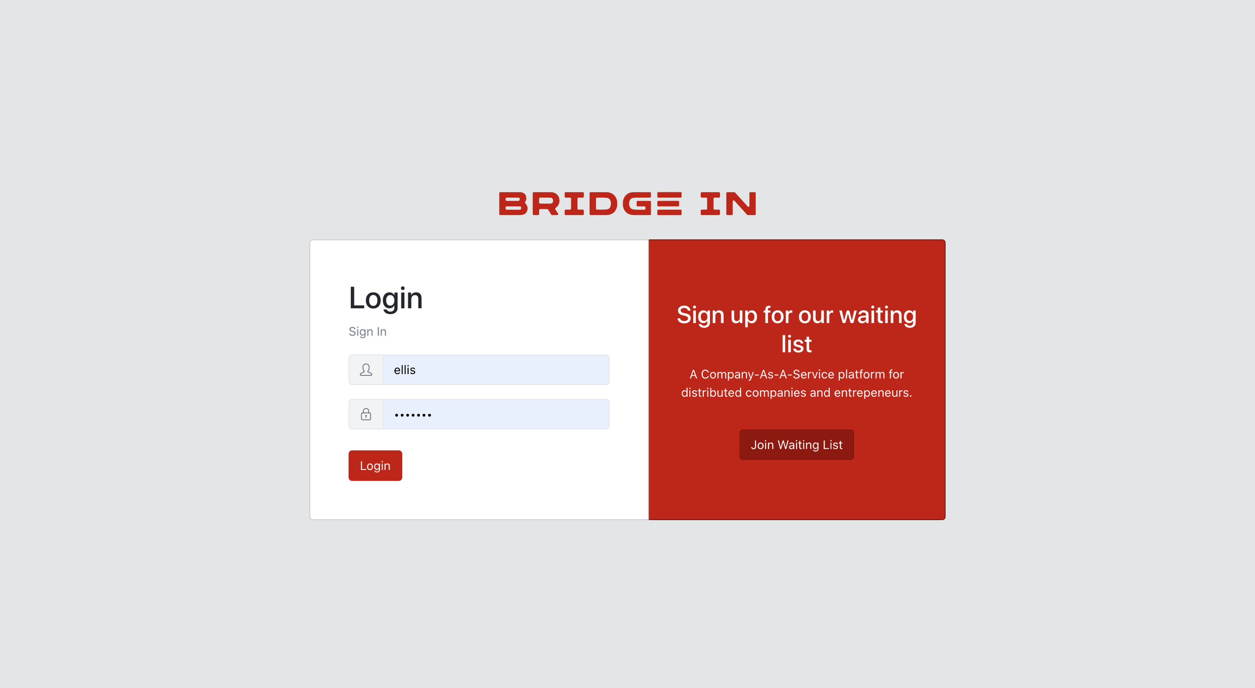
Initially, we planned on using the company’s color, red, but the manager requested it to be different. Thus, we chose blue as it projects authority, truth, and power.
Adding a Popup box helps in improving the user control. May it be an alert box, confirm box, or a prompt box. This can help users to ensure they are making the right decision before proceeding to the next step.
When the user made a mistake, alerting with a bold red color on the area allows them to identify the mistake and fix it immediately. This would include if the box is empty or there are unwanted characters.
CONCLUSION
At the end of the internship period, we created several new prototypes. However, there were still some things that we needed to fix to fit the users’ needs. I believe that if we were to have a stronger focus on the research before jumping into the redesigning process, we would be able to create a better prototype. Researching deeper on the internal platform will help us understand the features we need to create to help the users. Additionally to that, we would be able to create a different prototype and not have a similar design as the old prototype.